The Asset Performance Monitoring Dashboard provides an in-depth view of the QEP portfolio companies.
The QEP APM has seven (7) tabs:
Tools on Dashboards
Dashboards are based in Power BI.
Additional filters are on the side of each dashboard.

The top right of each visualization has additional functions. Click on the visual to activate the tools.
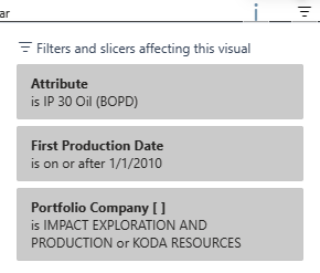
Filters show the filters used on the graph.
Focus mode will enlarge the graph to the full screen.

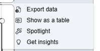
Ellipses will show additional features, such as view data as a table.
Drill down to a level of information lower. For instance, if a graph is showing by year, the drill down will show the level below, or quarter.

Drill up is also important when reviewing data.

Asset Summary
The Asset Summary provides a high-level overview of the portfolio by:
- Map View, colored by initial production year
- Wells Online by first production and target reservoir (Filtered by Actual, Reserves, Budget)
- IP & Cumulatives (Filtered to other production statistics)
- Gross Volume Daily Production (by Oil, Gas, BOE, MMCFE)
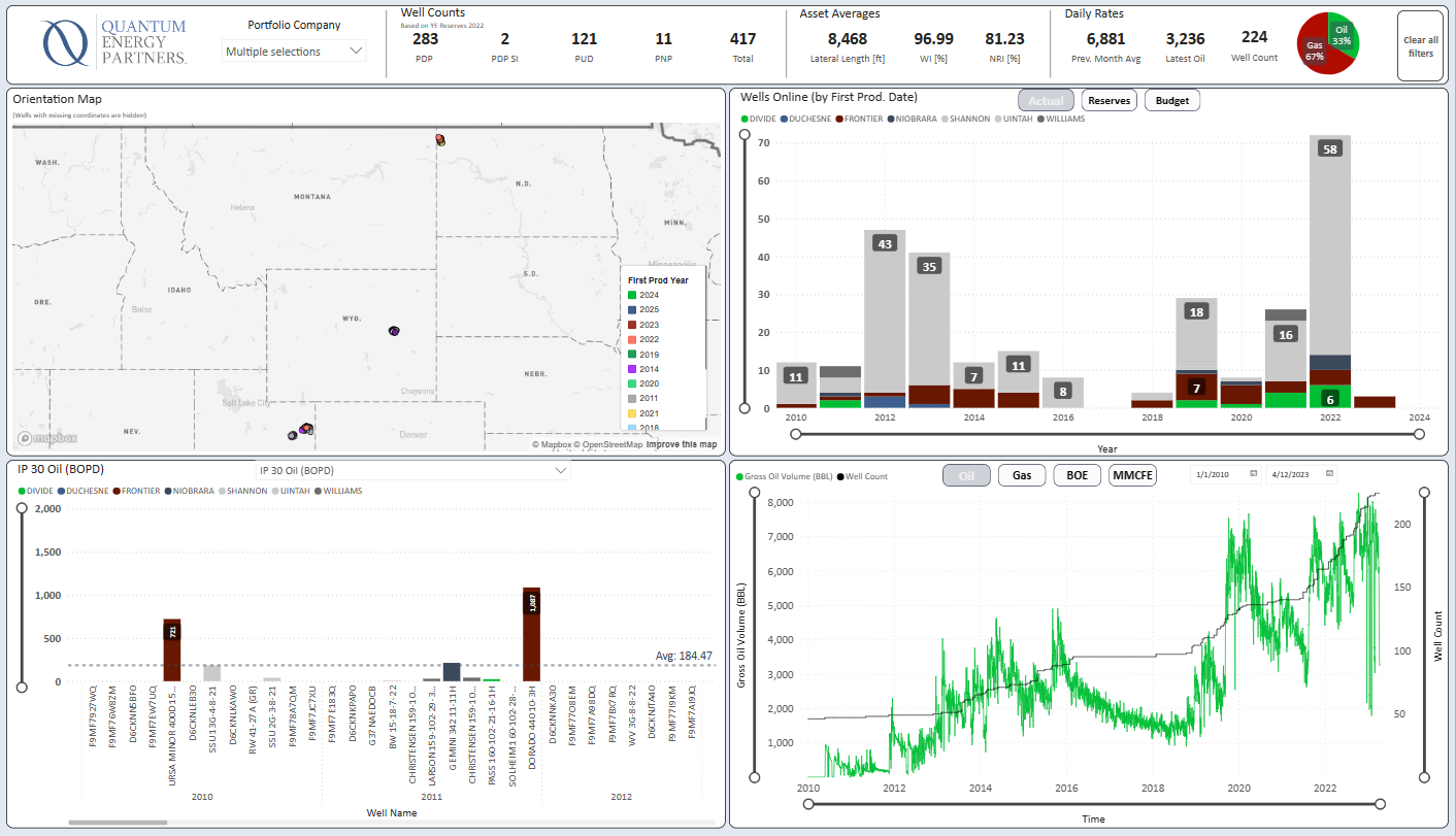
The top bar provides Portfolio Company, Well Counts, Asset Averages and Daily Rates.

PDP Summary
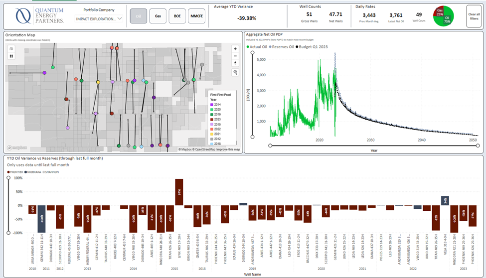
This tab only shows only PDP Wells. The purpose of the tab is to compare PDP Production vs. PDP Budget and PDP Reserves. The top right graph shows the Reserves and the Budget forecasts. The bar chart show year to date variance (net) to reserve.
Growth Summary
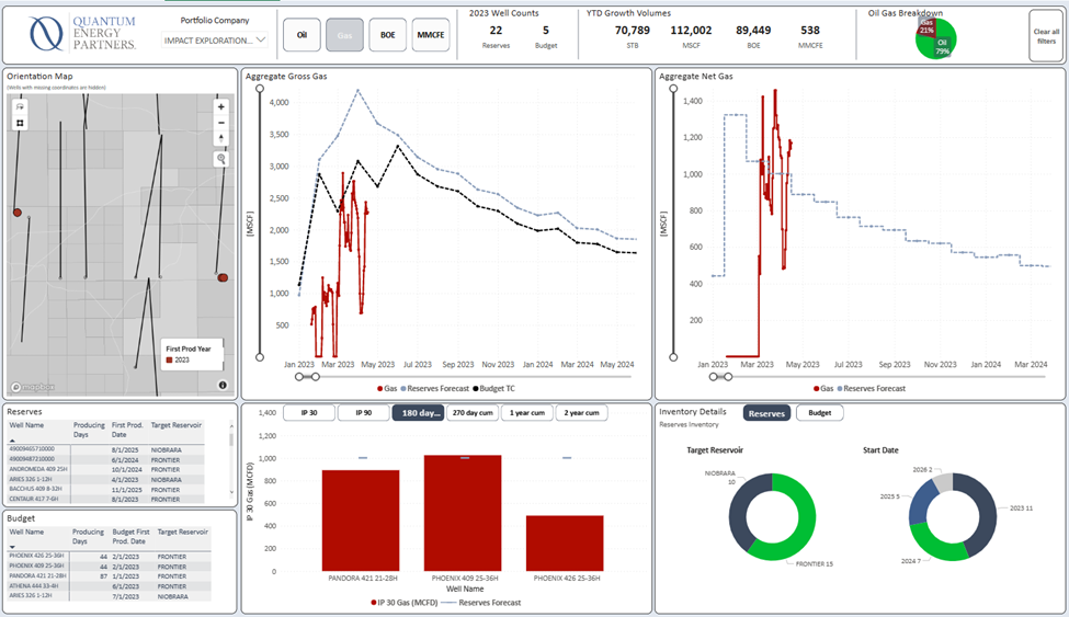
Growth is any well coming online in the current calendar year. The purpose of the tab is to compare the growth wells type curve vs. the reserve. Type curves can be viewed by the well selected on the bottom left of the tab.
Normalized Growth Wedge
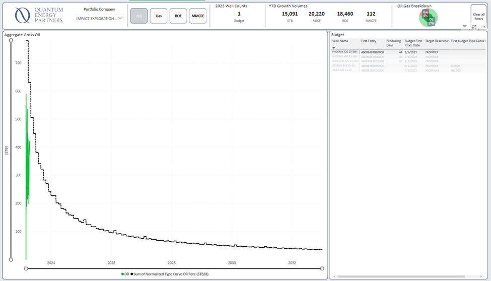
The normalized growth wedge tab shows the production of the current growth well vs a normalized type curve. The type curve is normalized for actual lateral length and for IP date.
Well Performance
This tab shows daily production normalized for time. These are only wells with production. The cumulative curve is on the right side of the tab. The bar graph shows KPIs. Yields are displayed on the bottom left graph.
The table below shows wells that can be selected to be shown on all graphs.
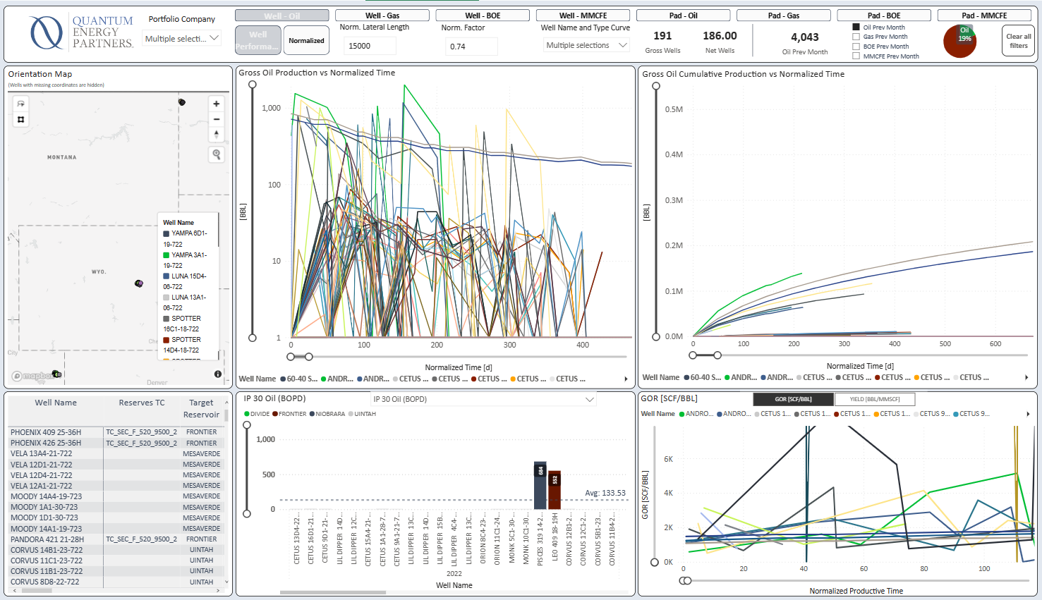
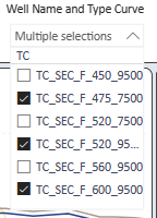
The top bar provides the ability to select normalization by Lateral Length and Factor as well as Specific Type Curves to display. The bar also provides opportunities to sort by specific criteria, such as well pad.

Normalization

Formula for normalizing production
[production_value] * ((([norm_lat_length] - [well_lat_length]) * [norm_factor]) + [well_lat_length]) / [well_lat_length]
Type Curve
Operations
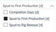
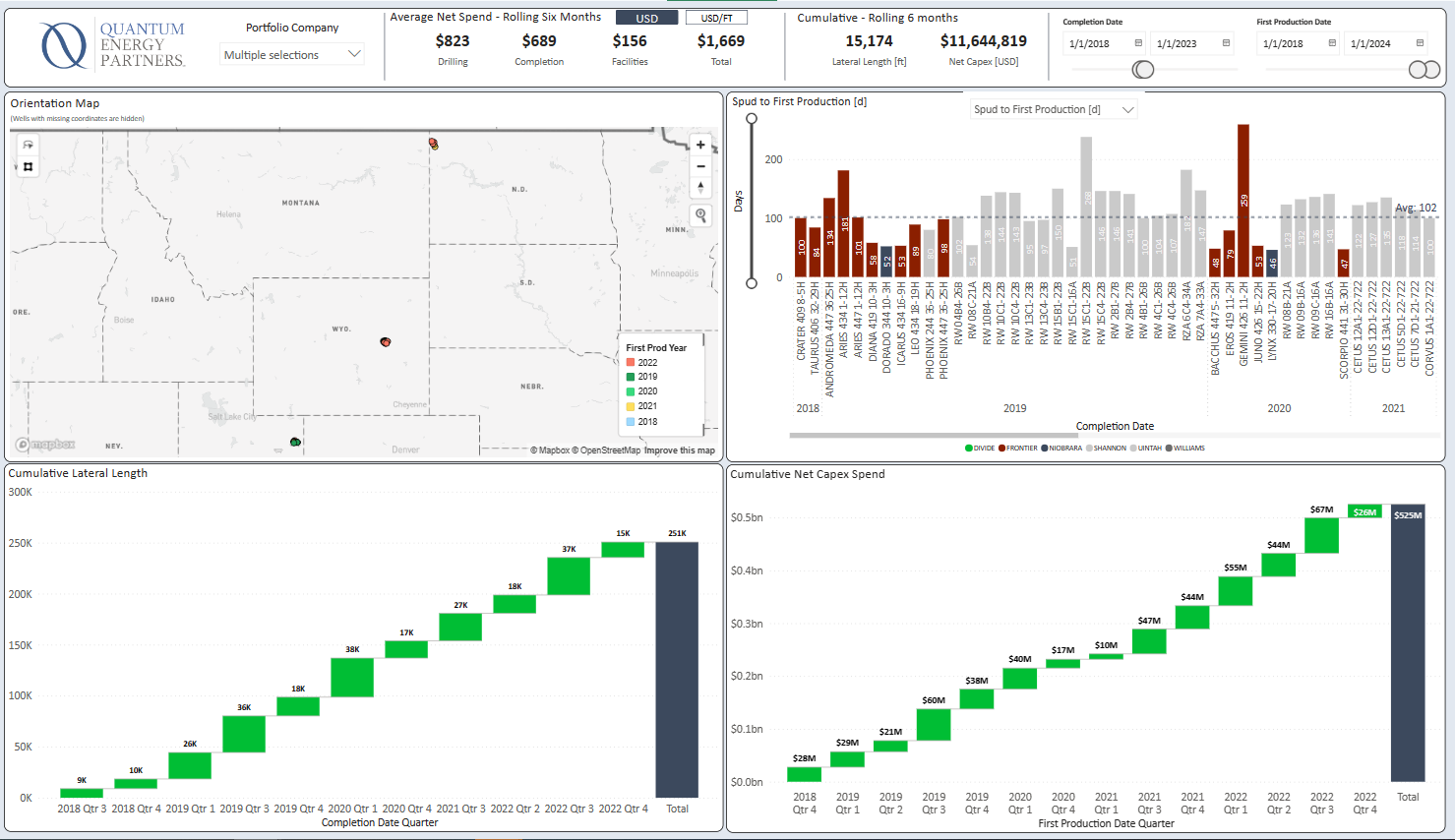
The operations tab can be shown by Completion days, Spud to First Production, Spud to Rig Release. The filter is on the top graph next to the map.
Depending on selection the waterfall charts display the Cumulative Lateral length and the cumulative NET capex spend. The waterfall charts have the ability to drill down using the dashboard tools.
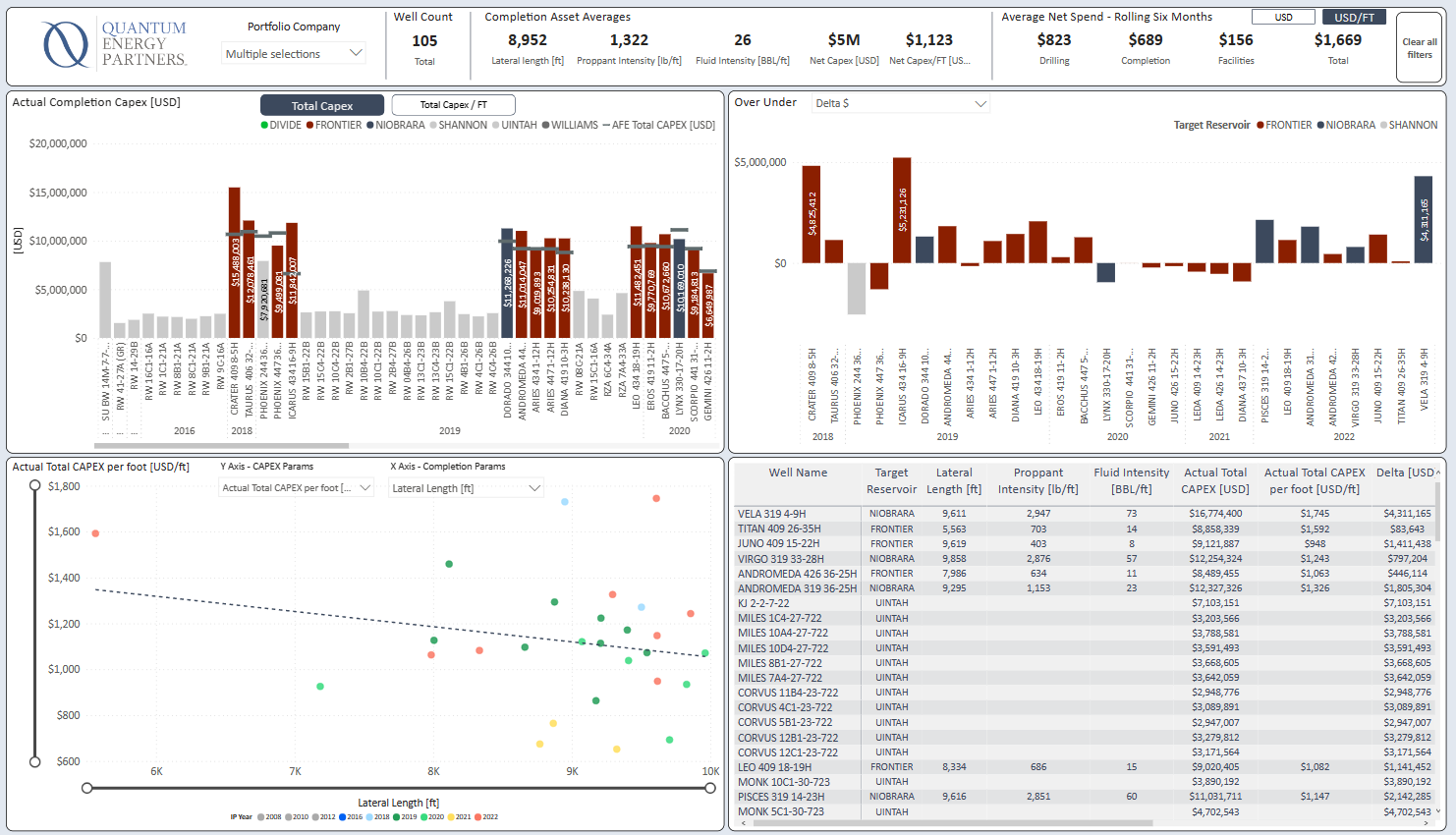
Capex
This tab displays wells actual completion capex vs. actual and by foot depending on selection. The Over Under displays the number of each well over or under the capex budget.
The scatter chart has the ability to select different metrics to view on the x-axis and y-axis.
The chart provides additional information for each well. Wells can be selected from the chart and the tab will filter to that well.
