Overview of the graphs in the PetroVisor Plunger Lift Dashboard
The purpose of the Plunger Lift Dashboard:
- Provide awareness of changes in plunger velocity, differential pressure, and produced gas. These changes highlight the need for an operator's attention.
- Support the plunger replacement team by bringing awareness to the maximum life cycle.
- Detect frozen sensors. Notify user of frozen sensor and suggest recommendations to operate based on velocity control and time on / off settings.
- Highlight wells that have flowmeter errors.
The Plunger Lift Dashboard consists of five (5) tabs.
- Summary
- Problem Detection
- Plunger Replacement
- Frozen Sensors
- Raw Data Last Month
Summary Tab
The Summary tab is the output of 5 alarms that highlights areas that need to be addressed.
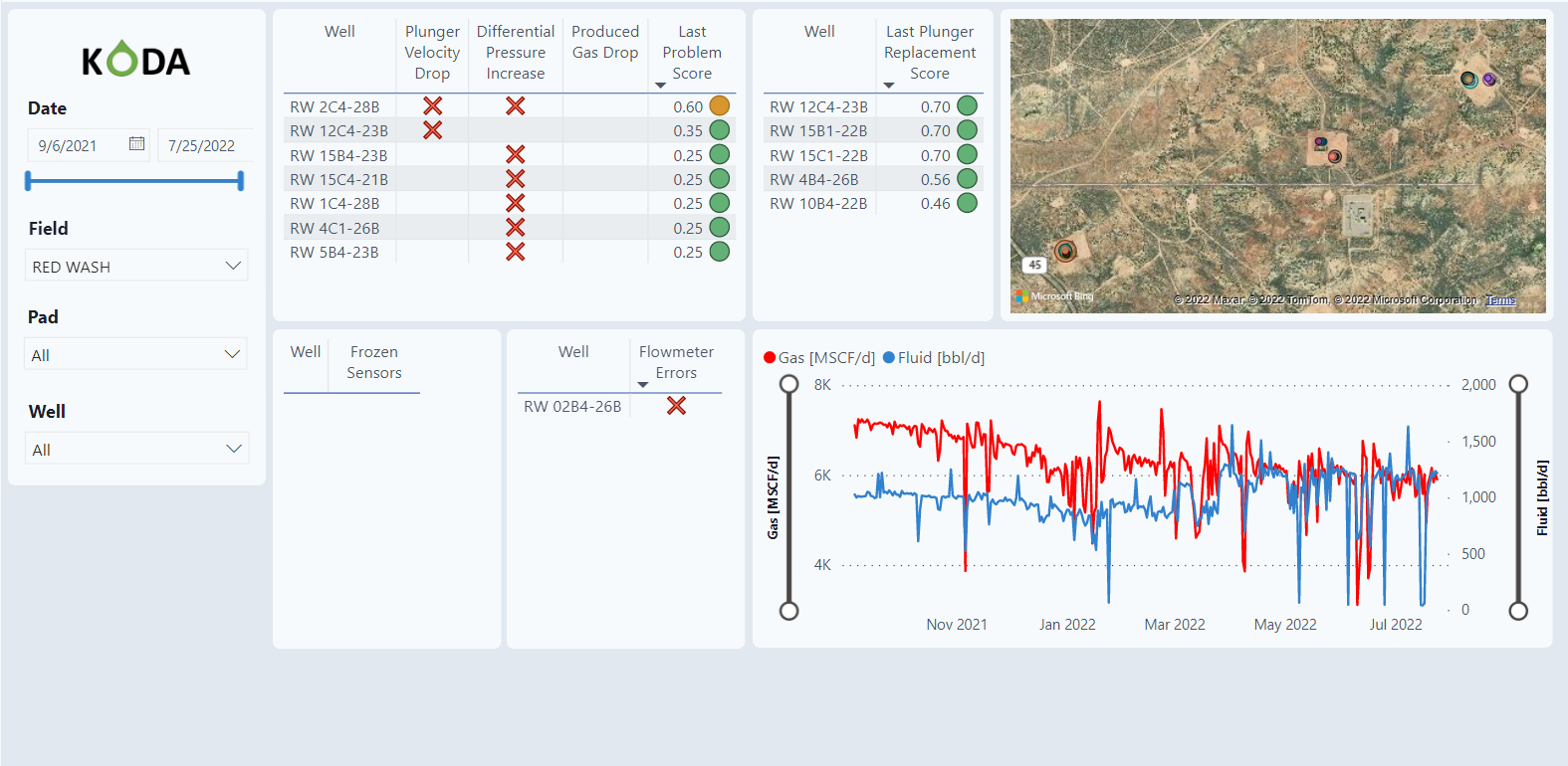
Filter
The dashboard has a slicer and filter on the left side of the screen. The filter allows the user to select specific dates as well as specific Fields, Pads, and individual wells.
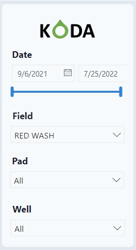
Alarms
The first section shows 5 different alarms. These are alarms that occurred in the last 24 hours.
- Plunger Velocity Drop
- Alarm if the plunger velocity is less than 0.7 of the previous 2-month moving median
- Suppress alarms during increased static line pressure (SLP)
- Extended shut-in: higher than 90% of all shut-in values
- SLP 4-day moving slope greater than 4 psi / day
- SLP at end of shut-in greater than at the beginning of shut-in by 10 psi or more
- Differential Pressure Increase
- Compare differential pressure at open end to 7-day moving average
- Alarm if there are 2 or more alarms in the last 24 hours
- Produced Gas Drop
- Alarm if produced gas volume less than 0.85 of the 7-day moving median
- Frozen Sensors
- Check extended shut-in durations: greater than 99% of all shut-in values
- Filter tubing pressure based on extended shut-in
- Alarm if 4-day moving average is greater than the 30-day moving average by 30 psi or more and it's in the winter months.
- Flowmeter Errors - the flowmeter does not read 0 for a certain period
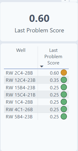
Last Problem Score - combination of the 3 problem alarms and ranks wells according to attention needed.
Score Calculation Method
- 0.25 of the differential pressure increase
- 0.35 of the plunger velocity drop
- 0.40 of the produced gas drop
Icon circles
- Green (0 to 0.4)
- Orange (0.4 to 0.75)
- Red (0.74 to 1.0)
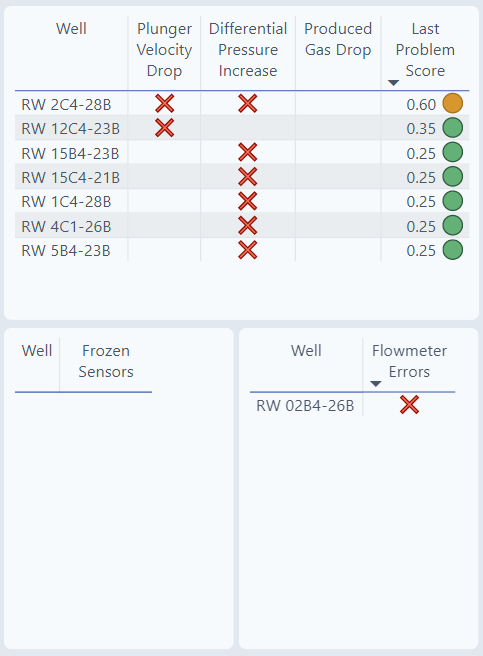
If a well appears in a table, it has an issue. For well RW 2C4-28B, there are two issues as seen in the table, both Plunger Velocity Drop and Differential Pressure Increase.

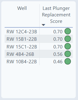
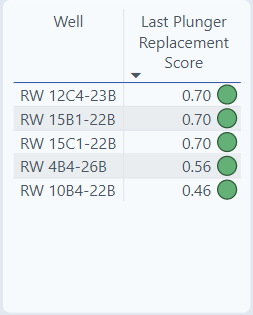
Last Plunger Replacement Score
The Last Plunger Replace Score raises the awareness that the plunger is getting to the end of its expected life. The score is a sum of two scores: the plunger milage score & the plunger wear index. It's a score from 0-1. As the well approaches its life expectancy, the score gets closer to 1. A well with a score of 0.7 is closer to being replaced than a well with a score of 0.46.
Score Calculation Method
- 0.7 of the plunger milage score
- Plunger mileage = Number of Cycles Based On production duration cleansed signal * bumper spring depth in "mi" *2
- Expected mileage is the maximum mileage for each well when available (max mileage one day before replacement event)
- Plunger mileage Score= plunger mileage in "mi"/ Max ("expected plunger mileage" in "mi")
- Closeness To End of Expected Mileage Alarm= If "plunger mileage" in "mi" >= Max ("expected plunger mileage" in "mi") * 0.93
- 0.3 of the plunger wear index
- Plunger wear index ml: value between 0-1, absolute error normalized between predicted and actual gas rate
- predicted gas rate using the model "Gas Rate - Complete Cycle Wells 1 Min," which is run from start to end minute data
Icon Circles
- Green (0 to 0.93)
- Orange (0.93 to 0.97)
- Red (0.97 to 1)
Map
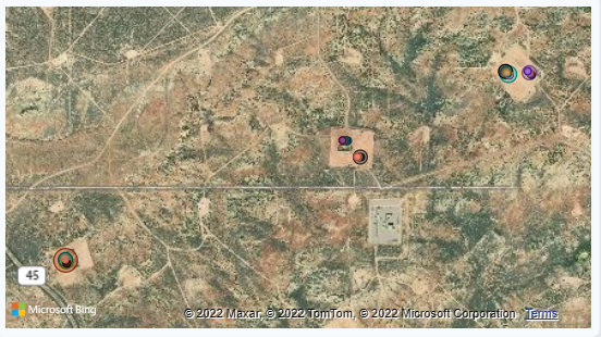
The map displays the location of all the wells. The bubble size of the well location refects the problem score.
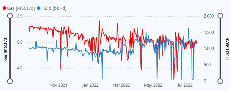
Graph
The graph plots Gas and Fluid over time.
Problem Detection Tab
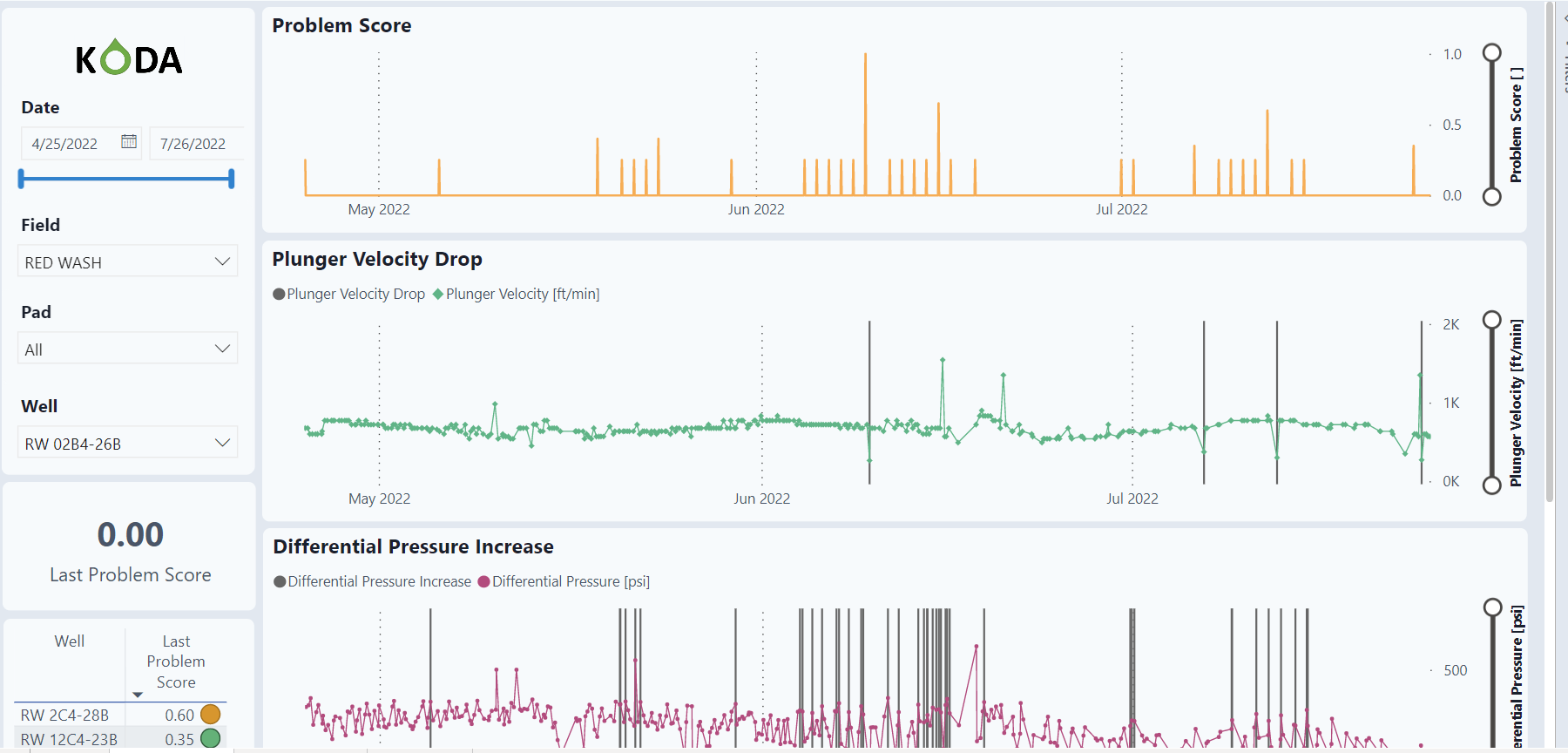
Problem Detection raises awareness of Plunger Velocity Drop, Differential Pressure Increase, and Produced Gas Drop.
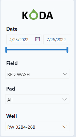
Filter
The dashboard has a slicer and filter on the left side of the screen. The filter allows the user to select specific dates as well as specific Fields, Pads, and individual wells. Notice that this dashboard is for viewing individual wells and one must be selected to view the graphs.
Last Problem Score
Below the filter, the Last Problem Score is shown for the individual well as well as a list of all wells with a problem score.
Graphs
The graphs show the problem score over time as well as the 3 variables that comprise the problem score.
Problem Score for selected well
The problem score is a combination of Plunger Velocity, Differential Pressure and Produced Gas Drop with different weights.

Plunger Velocity Drop for selected well
The graph displays the raw data over time as well as the flags (gray bars) for an alarm. The alarm for velocity is if it drops below 0.7 from the last 2-month average.

Differential Pressure Increase for selected well
The graph displays the raw data over time as well as the flags (gray bars) for an alarm. The alarm for different pressure increase is if there are 2 or more alarms in the last 24 hours and both the differential pressure and the moving average is greater than 0.

Produced Gas Drop for selected well
The graph displays the produced gas rate aggregated using minute data as well as the flags (gray bars) for an alarm. The alarm for gas is if the moving average is less than 0.85 of the last week of data.

Plunger Replacement
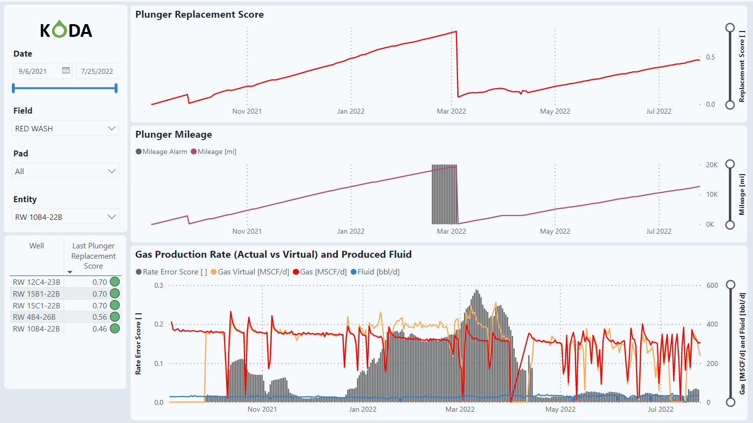
This raises awareness on plungers getting to the end of its life cycle. Scores closer to 1 mean the plunger is approaching the end of its lifecycle.
Filter
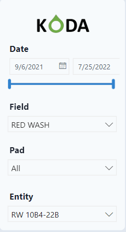
The dashboard has a slicer and filter on the left side of the screen. The filter allows the user to select specific dates as well as specific Fields, Pads, and individual wells. Notice that this dashboard is for viewing individual wells and one must be selected to view the graphs.
Last Plunger Replacement Score
The table lists wells that are approaching the end of the lifecycle. As wells get closer to 1, the plunger will have to be replaced.
Graphs
The graphs show the Plunger Replacement score over time based on Plunger Milage and Plunger Wear.
Plunger Replacement Score
The Plunger Replacement Score is based on 0.7 of the Plunger Mileage and 0.3 of the Gas Production Rate.

Plunger Mileage
The alarms start at 90% of the expected plunger milage.

ML Predicted Gas Rate
This graph uses a Machine Learning model comparing the actual gas rate vs. the ML gas rate. Any divergence between the two values gives an indication to plunger wear.

Frozen Sensors
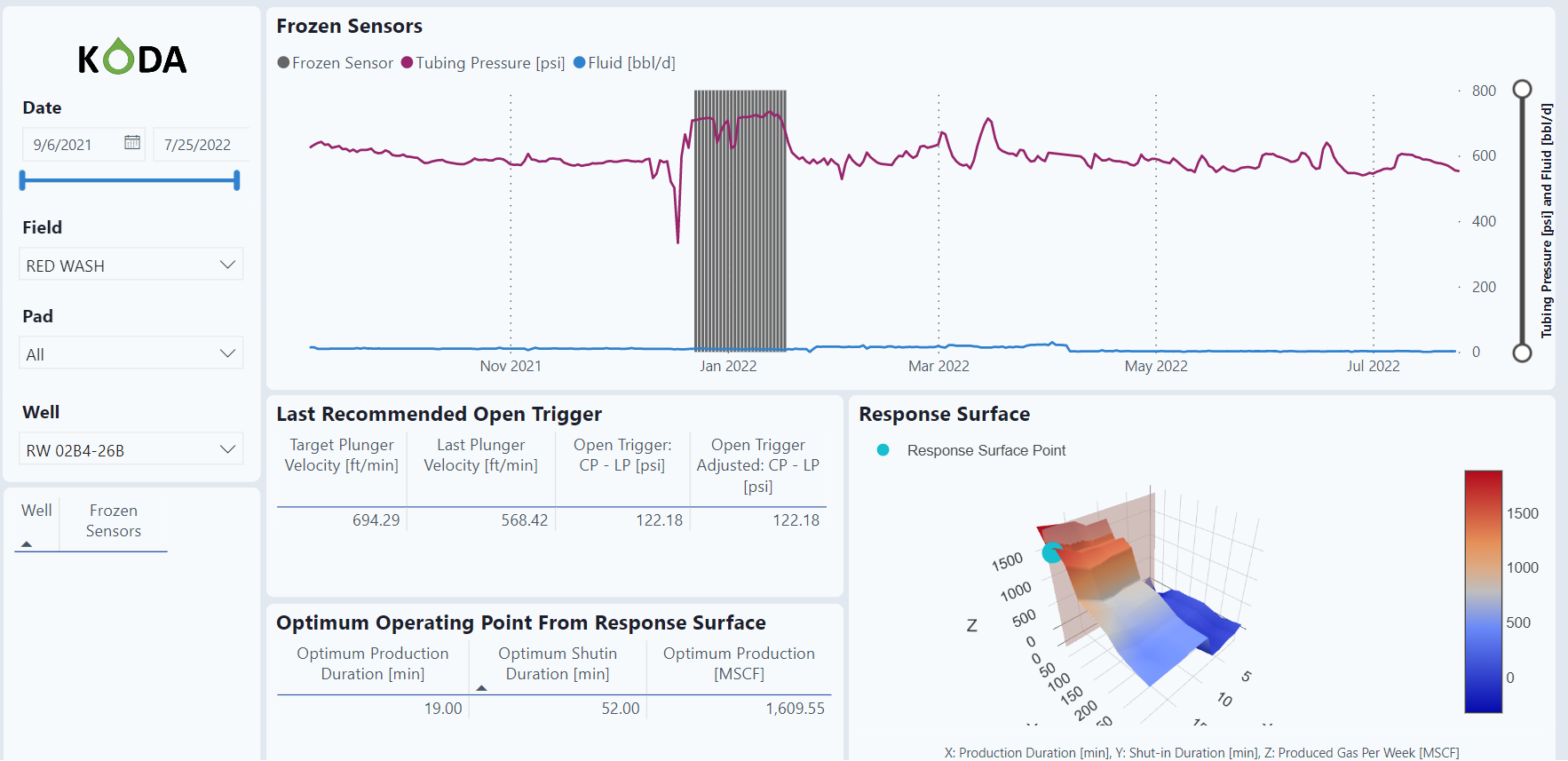
These sensors are most likely to be used in wintertime. The logic looks for abnormal increases in December, January, and February.
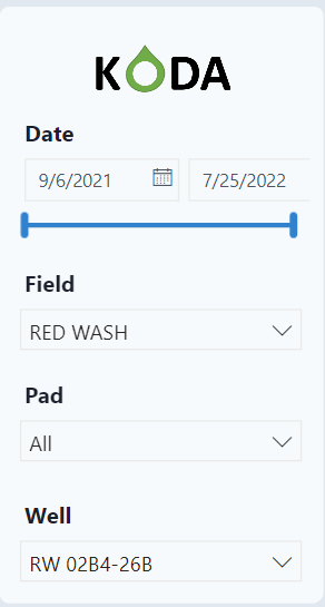
Filter
The dashboard has a slicer and filter on the left side of the screen. The filter allows the user to select specific dates as well as specific Fields, Pads, and individual wells. Notice that this dashboard is for viewing individual wells and one must be selected to view the graphs.
Frozen Sensor
This table will populate a list of wells with a frozen sensor issue.
Graphs
Frozen Sensors
Tubing pressure over time. The vertical lines indicate a potential frozen sensor with abnormal high pressures.

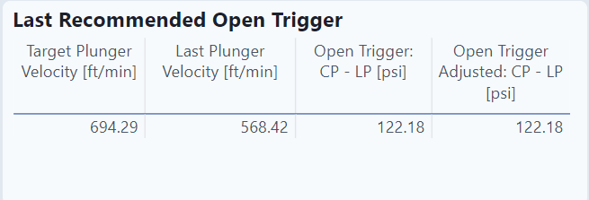
Last Recommended Open Trigger
This table recommended the optimum plunger velocity for the given problem.
Optimum Operating Point From Response Surface
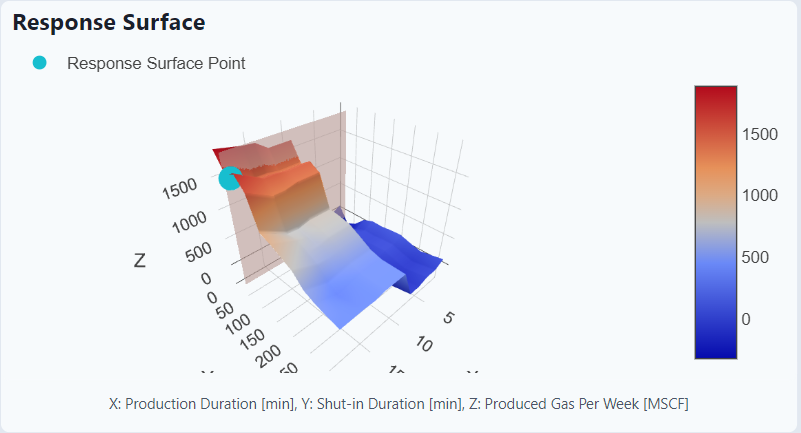
This table uses a machine learning model to recommend an on / off approach to get to the optimum production.

Response Surface
This graph is a visualization of the trained machine learning model and the optimum operating point (in blue.)
Raw Data Last Month
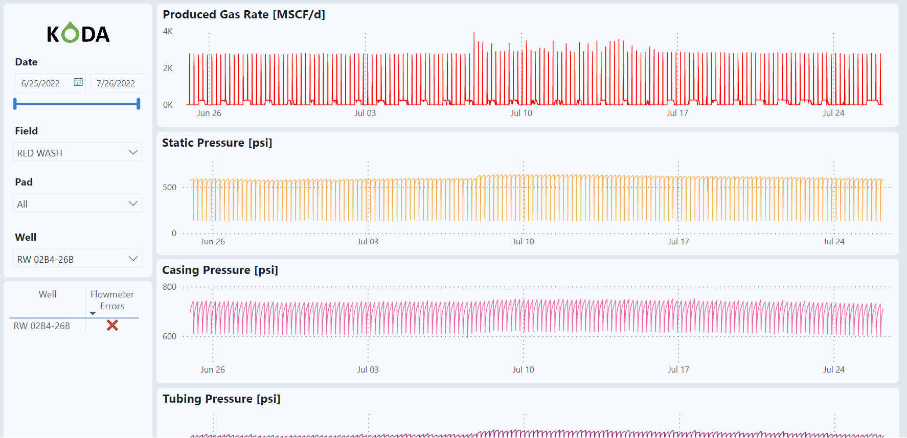
This dashboard has the minute data for the last month.
Filter
The dashboard has a slicer and filter on the left side of the screen. The filter allows the user to select specific dates as well as specific Fields, Pads, and individual wells. Notice that this dashboard is for viewing individual wells and one must be selected to view the graphs.

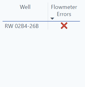
Flowmeter Errors
This table will populate wells with flowmeter errors.
Graphs
These are plots of all the raw data for the last month as well as combined analysis graphs.
Produced Gas Rate
 Static Pressure

Casing Pressure
 Tubing Pressure

Produced Volumes

Pressures

Pressures and Volumes

