The purpose of the Completion Summary Dashboard is to determine a data set to run the PetroVisor Completion Optimization.
Completion vs Date
The main areas the Completion Summary Dashboard takes into consideration are:
- Geological
- Completion Variables
- Mechanical
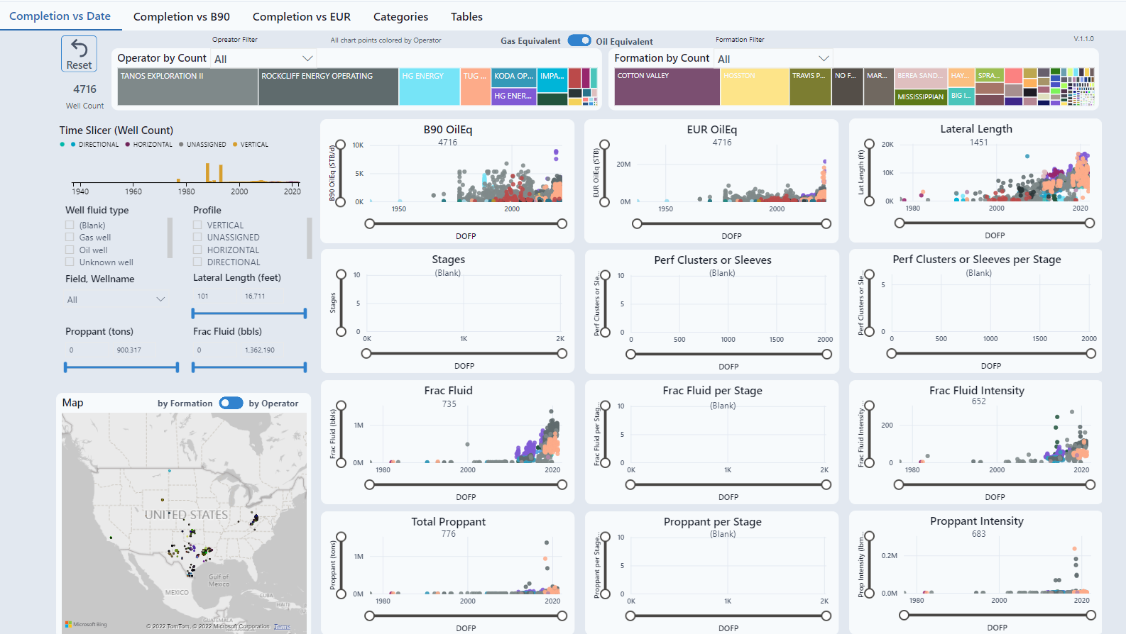
Each variable looks at the impact on the completion through time and the impact on the recoveries. This view is data discovery. The additional tabs are how the variables change over time. Ideally, the wells on this dashboard would be in a specific basin to view how each well compares to others or in an area to compare a client well to other wells in the area.
The areas of comparison will be determined by available variables. The display is information pulled from public sources. Using private sources, we would also use variables such as stage level, cluster level, entry point, and subsurface interpretations. These are CAPEX optimization decisions and displayed.
The purpose of this chart is to determine data sets to use ML or MVR models to optimize the completion. Some examples:
- View outliers for QC purposes and filter out
- Split data set, example would be geological changes
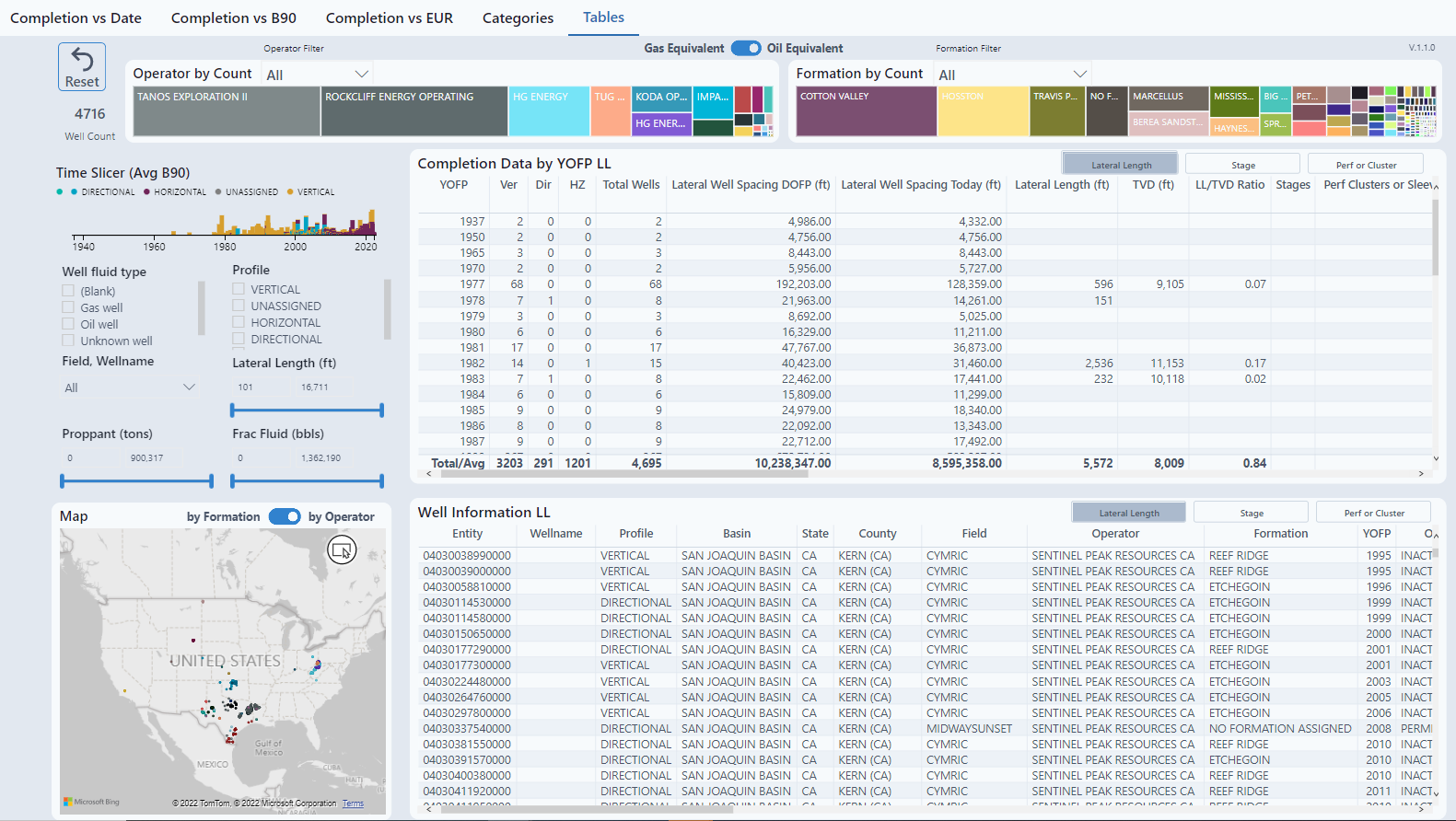
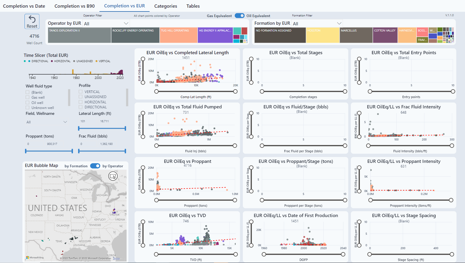
The top of the chart displays operator and formation. Clicking a specific block will sort the chart to display only that information. There is also a toggle for Gas Equivalent and Oil Equivalent.

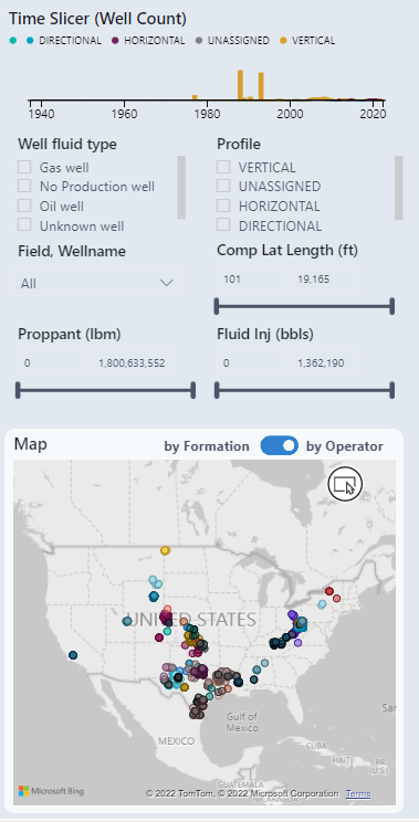
The left side of the chart has a slicer and a map to look at specific areas or variables.
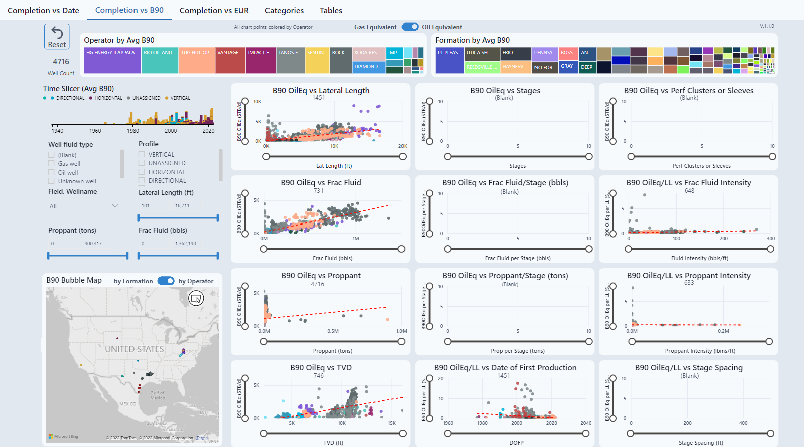
Completion vs B90
This chart views how recovery (Best 90 Days) compares to different properties assigned to the well bore. The line is an average line displaying a potential correlation. Depending on the correlation, different data sets could be established to run completion optimization.
Completion vs EUR
This chart views how recovery (EUR) compares to different properties assigned to the well bore. The line is an average line displaying a potential correlation. Depending on the correlation, different data sets could be established to run completion optimization.
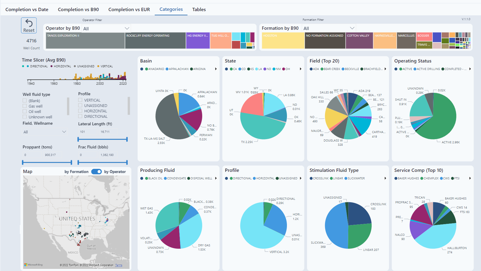
Categories
This chart looks at ways to group wells by specific attributes. A specific example to use this graph would be to view the Eagle Ford Basin. It quickly goes from oil to dry gas. It would be obvious to group wells with oil together as a data set and wells with gas as another data set for completion optimization.
Tables
Summary of data.